Containers competed with the questions
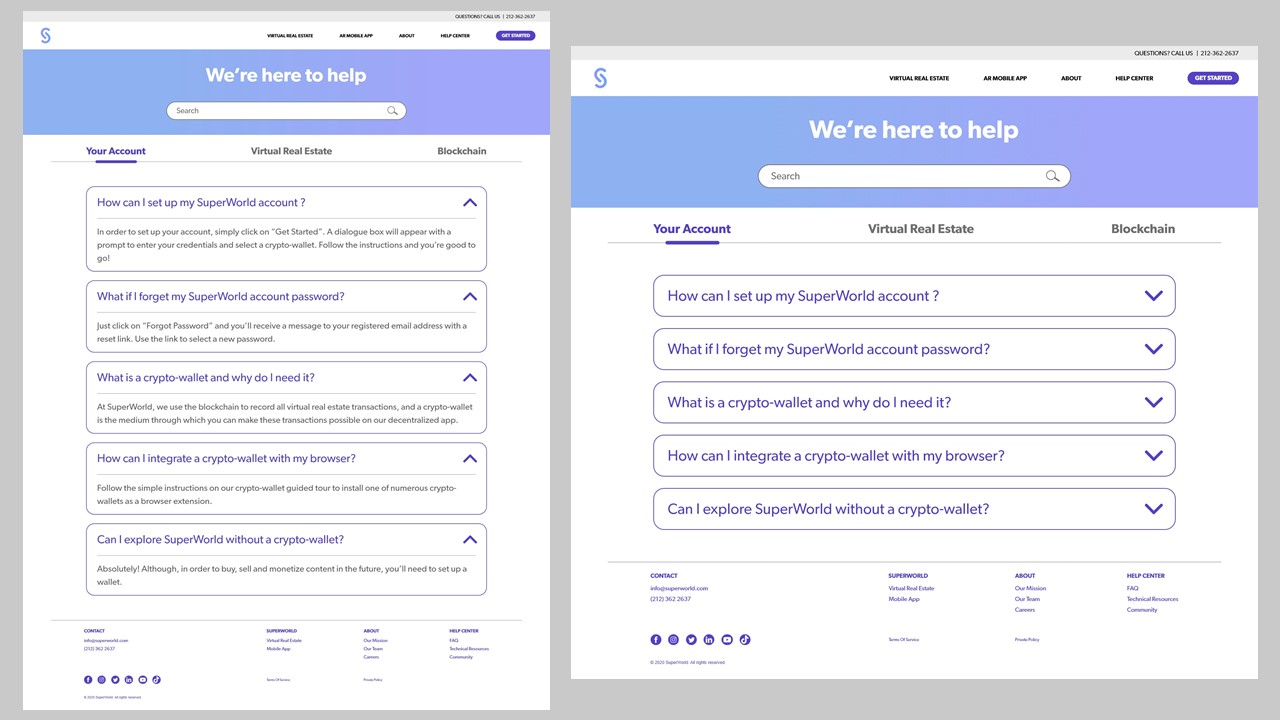
The first direction used boxed top tabs and repeated containers around categories and answers.
Making virtual places
feel familiar.
I helped turn an abstract AR virtual-real-estate proposition into a responsive journey that first-time visitors could understand, explore, and act on. The combined shipped experience was associated with a 12% relative increase in sign-up conversion.
Jump to a decision, or follow the story below.
SuperWorld maps an augmented-reality virtual world onto real locations, but first-time visitors had to understand unfamiliar ideas before they could see the product’s value: virtual real estate, decentralized ownership, digital plots, and location-based AR content.
As a UI/UX Design Intern, I owned the assigned Homepage, FAQ, Contact, and Virtual Real Estate experiences from exploration through final responsive design. I worked with Product, Design, Video, and Development teams through feedback, developer handoff, and responsive QA. All final designs launched during the internship.
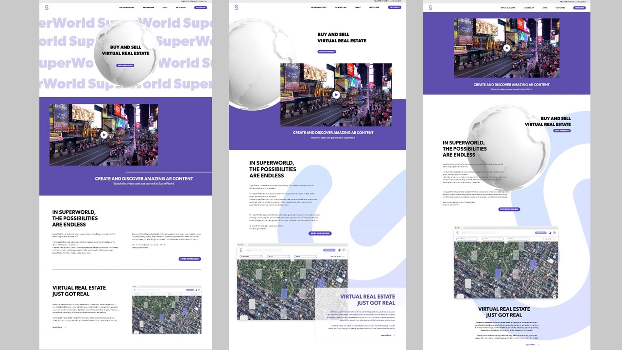
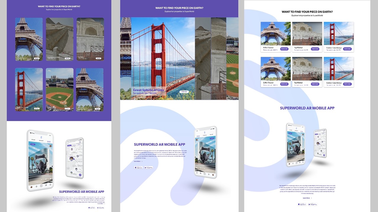
For the Homepage and Virtual Real Estate page, I explored gallery, cursor-driven, and card-based layouts. Gallery and cursor interactions created more visual movement, but they placed additional interaction between visitors and the information they needed.
Cards made the relationship among location imagery, product explanation, and available actions easier to scan and more predictable across screen sizes. The final direction paired product information with recognizable place examples. A globe remained the visual focal point and linked to the introduction video rather than embedding a large video directly into the page.
Real user feedback showed that first-time visitors needed a clearer way to resolve questions about accounts, virtual real estate, and blockchain-related concepts.
I designed one support journey: keyword search, Account / Virtual Real Estate / Blockchain categories, expandable answers, and Contact as the fallback when self-service was not enough. After form submission, confirmation stayed on the same page so visitors did not lose context to a separate success screen.
Visitors search by keyword or choose Account, Virtual Real Estate, or Blockchain.
Accordion behavior keeps multiple answers available without creating one dense page.
Visitors continue to Contact only when the FAQ does not resolve their question; confirmation remains inline after submission.
The first FAQ direction used boxed category tabs and multiple background containers. Real user feedback called for a flatter, simpler interface.
I moved category navigation to the left, removed unnecessary boxes and background fills, and relied on spacing, lines, headings, and a clear purple selected state. The revision preserved search, categories, and accordion behavior while making the questions the dominant content.
The first direction used boxed top tabs and repeated containers around categories and answers.
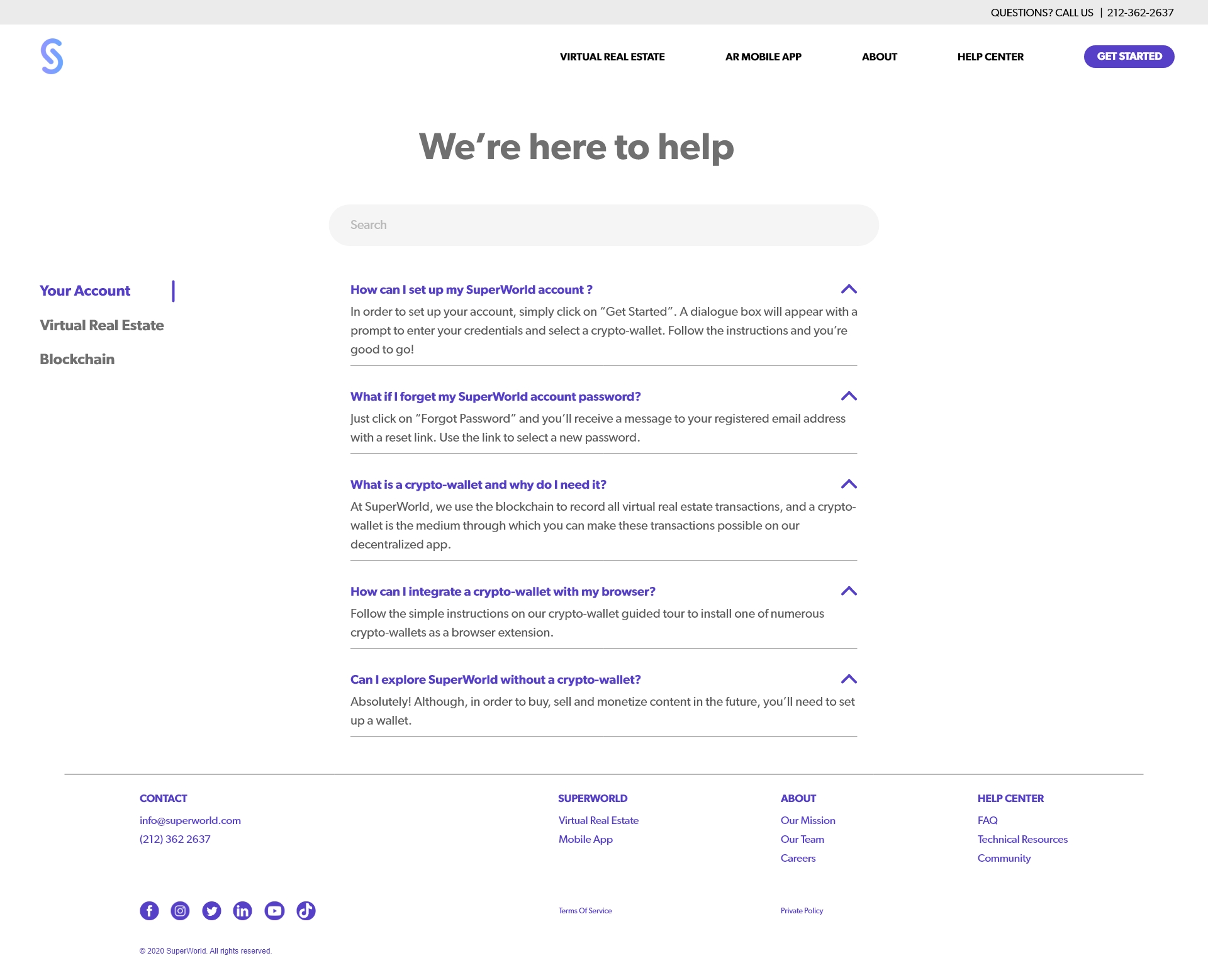
The shipped direction moved categories left and used spacing, lines, and a selected state to clarify navigation.
The Homepage, FAQ, Contact, and Virtual Real Estate experiences were designed for desktop, tablet, and mobile. Each breakpoint preserved the relationship among product explanation, place examples, category navigation, FAQ answers, and next steps instead of simply shrinking the desktop composition.
I prepared responsive designs and interaction states in Figma and Adobe XD, worked with the development team during handoff, and participated in responsive QA before launch.
Working with the Video team, I contributed storyboards, footage selection, motion graphics, special effects, and editing in After Effects and Premiere. The introduction video explained decentralized relationships, the scale of 100×100m virtual plots, location pins, app functions, and the globe visual.
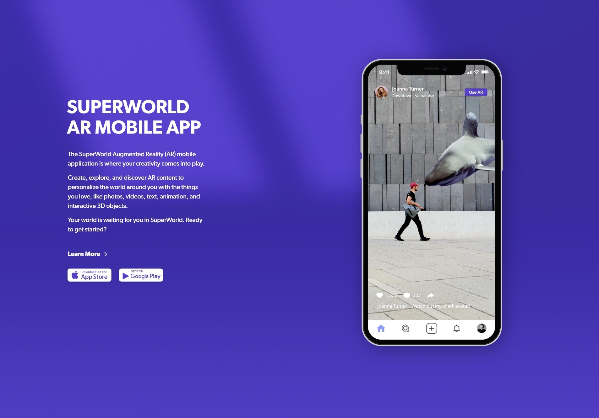
An early direction repeated phone mockups to demonstrate each feature. In the final version, I replaced repeated device frames with direct interface footage where the mockup no longer added context. This reduced visual redundancy and kept attention on product behavior.

The storyboard and first direction repeated phone mockups to separate mobile functions.

The final direction used interface footage directly once device context was already established.
After the final Homepage, FAQ, Contact, and Virtual Real Estate experiences launched, website analytics showed a 12% relative increase in sign-up conversion compared with the previous period.
This was a before-and-after comparison, not an A/B test, so the result should not be attributed to one page or interaction in isolation. It indicates that the combined improvements were associated with stronger progression toward sign-up.
Visual excitement helped attract attention, but clarity made the product actionable. The strongest decisions translated unfamiliar technology into things visitors could recognize: real locations, specific questions, clear categories, and visible next steps.
The project also changed how I use motion and device mockups. They are most valuable when they explain product context or behavior; once that context is established, direct interface evidence is often clearer.