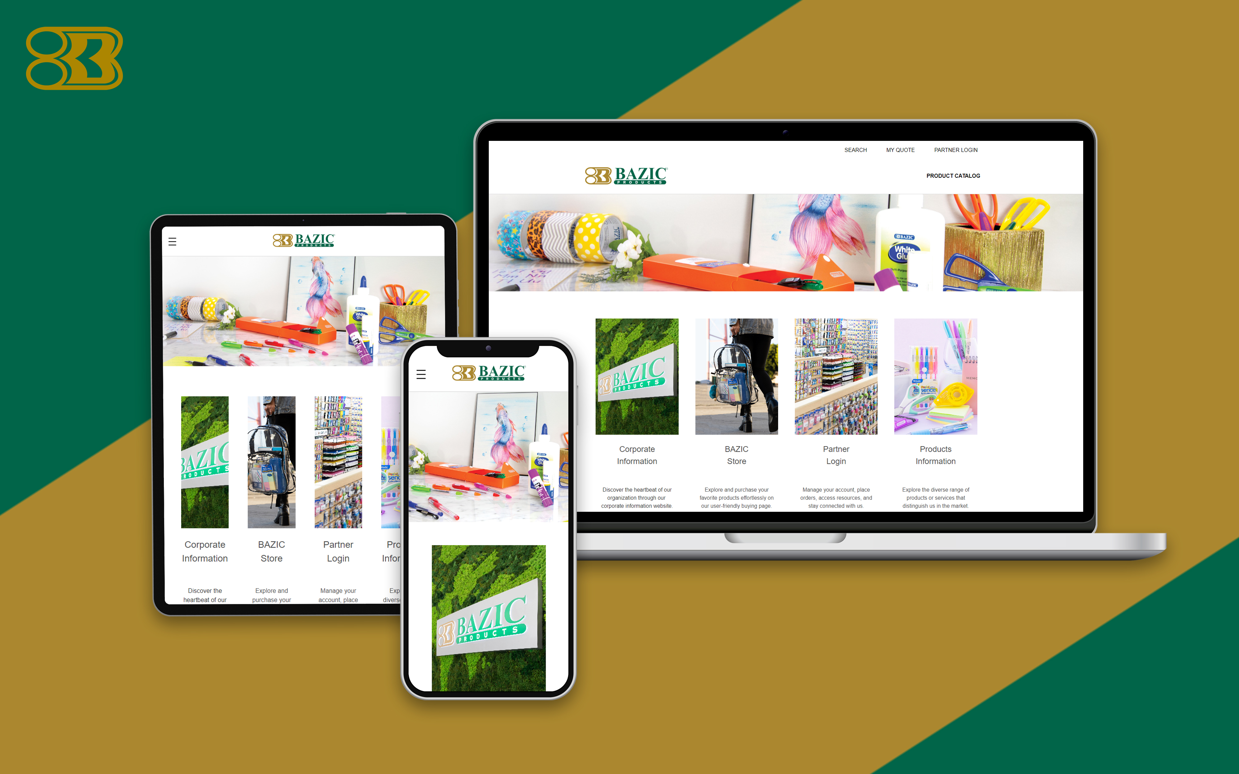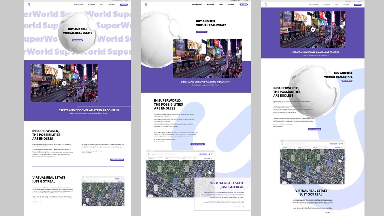
Early versions
The first layouts carried more competing elements, alignment issues, and a broader palette.
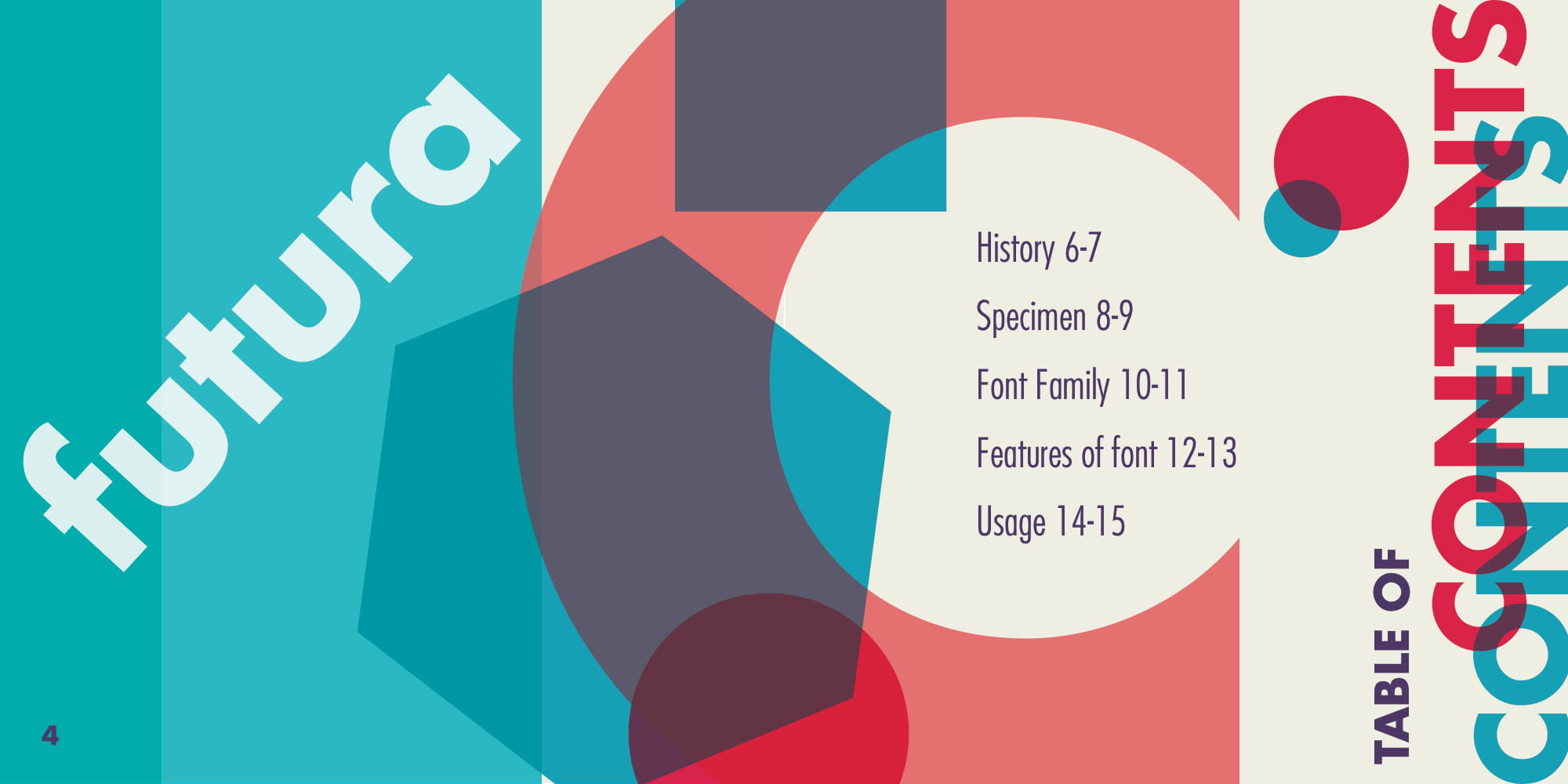
An academic booklet refined through three rounds of layout and typography.
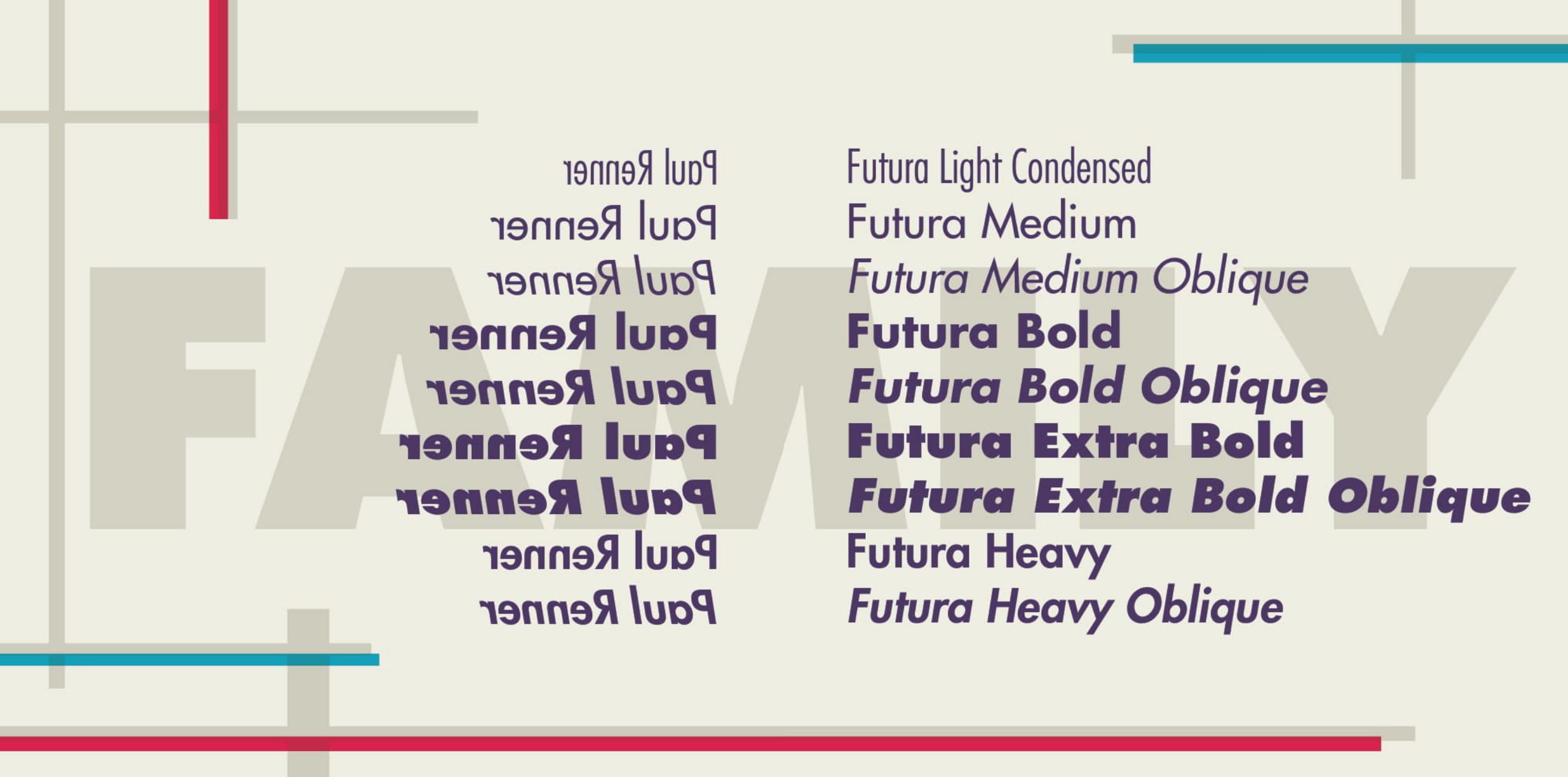
I designed a 16-page specimen that examines Futura’s history, forms, family, and use. Across three versions, I simplified crowded layouts, corrected logo colors, improved paragraph alignment, and reduced the palette to blue, red, beige, and purple.
The first layouts carried more competing elements, alignment issues, and a broader palette.
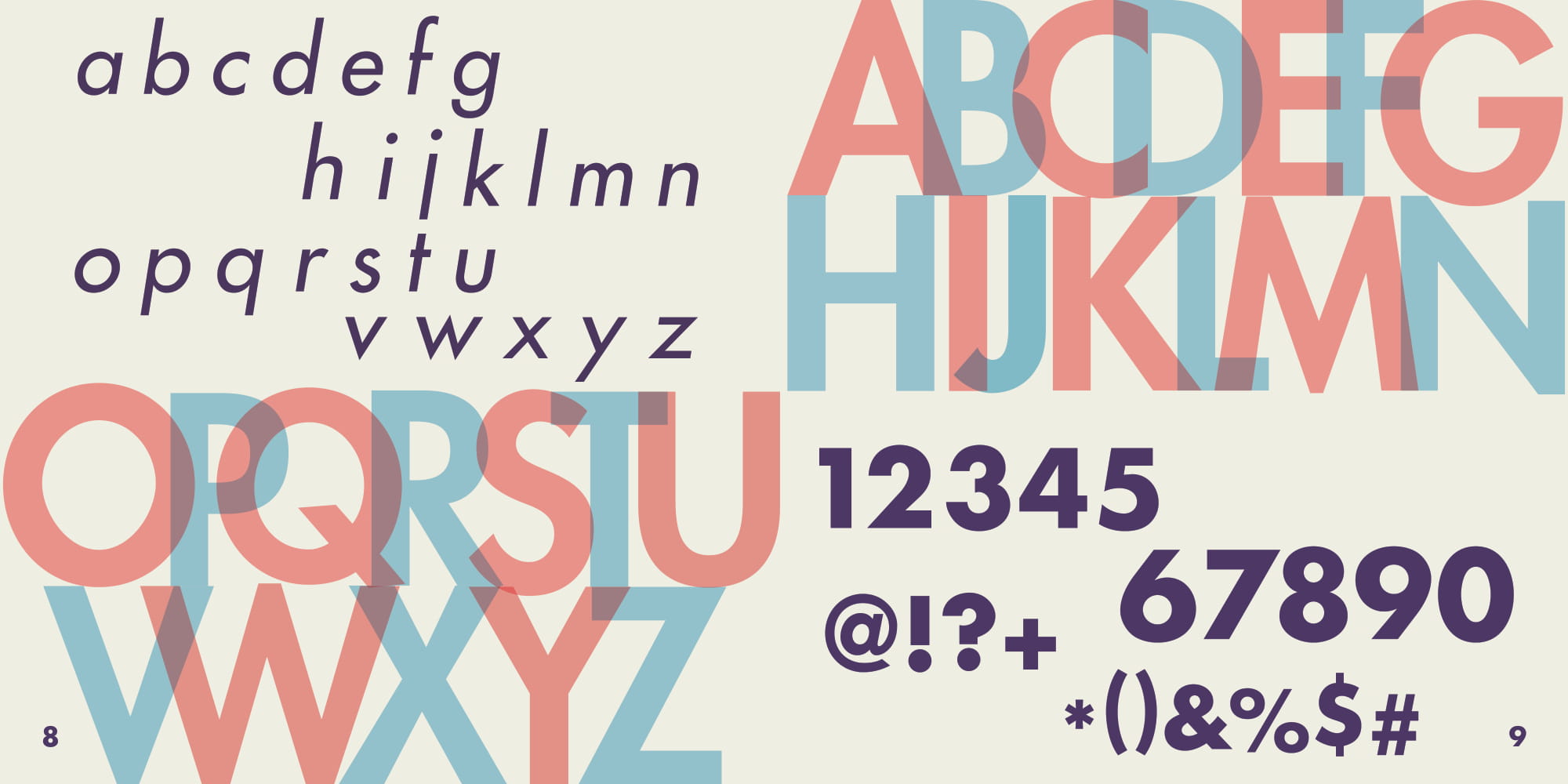
The final version simplifies the layout, tightens alignment, and limits the palette.
The completed academic booklet uses geometric forms and page titles to echo Futura while keeping the type specimen in focus.