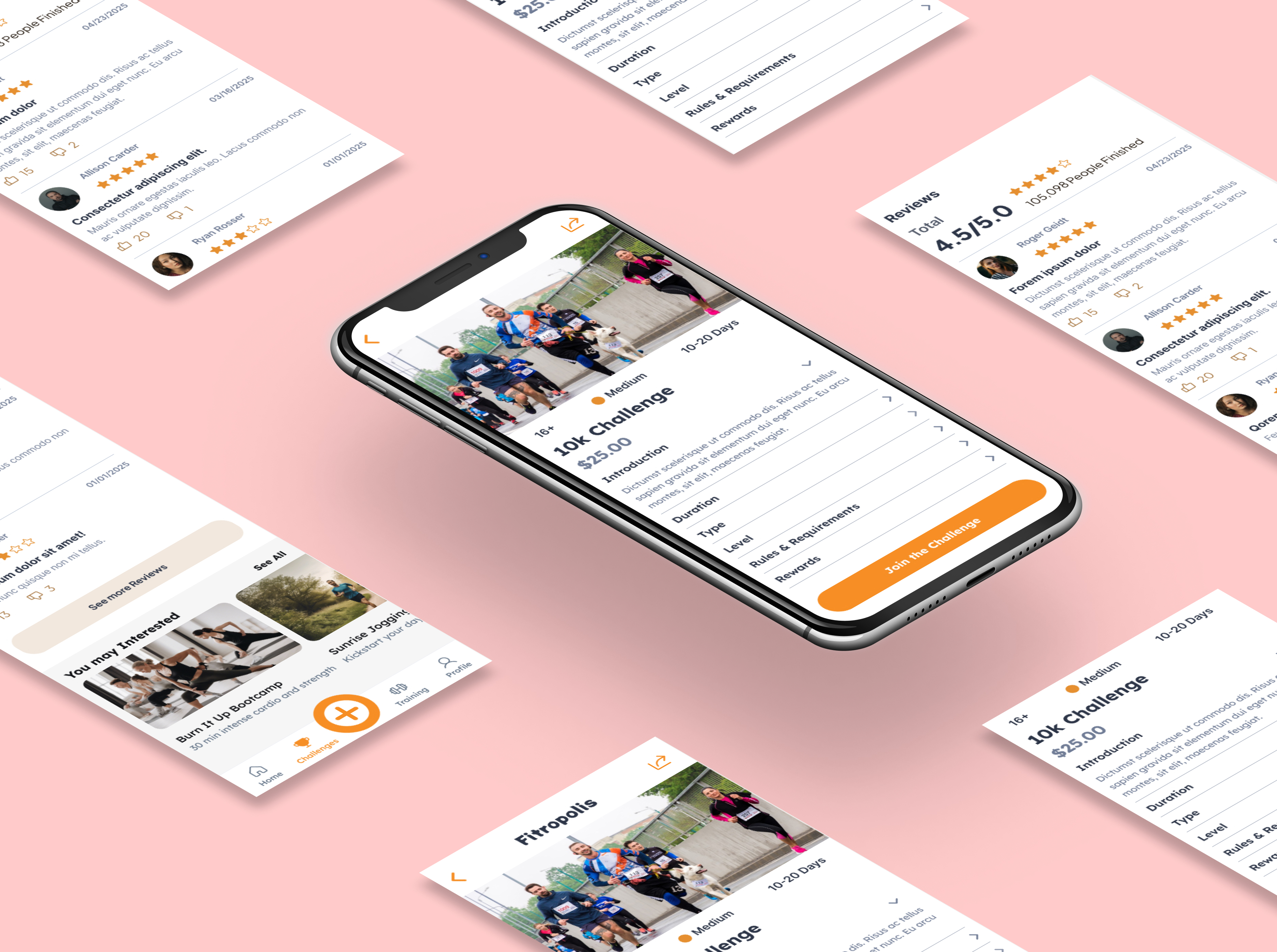
Wireframes separated evaluation and tracking
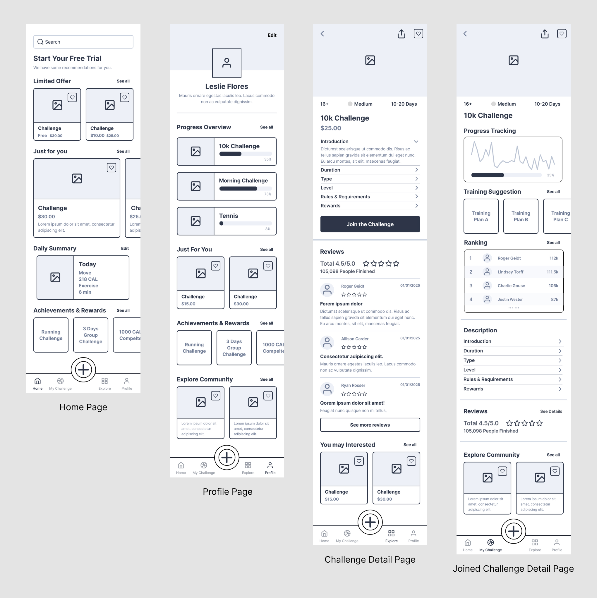
Low-fidelity Home, Profile, Challenge Detail, and Joined Challenge Detail screens established content priority before visual styling.
From joining a challenge
to making progress.
Fitropolis translates research on motivation and accountability into one buildable social-challenge lifecycle: discover, evaluate, join, track, then move toward reward and support. The research-informed MVP is in active development with an engineering partner.
In Development · MVP in active development; not yet launched.
Jump to a decision, or follow the story below.
I surveyed approximately 50 people who either exercised already or wanted to start building a fitness habit. I followed the survey with five user interviews and reviewed challenge, progress, and reward patterns in Nike Training Club, Strava, and Fitbit. Google Forms supported the survey, while Figma supported flows, wireframes, prototyping, UI, and handoff.
The research showed that motivation was connected to accountability, challenge fit, visible progress, and the tone of competition, not tracking alone.
The early idea included workout tracking, personalization, social sharing, community, AI coaching, subscriptions, and challenge features. Building all of them at once would make it difficult to test whether the central interaction worked.
I narrowed the MVP to discover → evaluate → join → track → reward / support. Registration, challenge browse/search, Challenge Detail, join confirmation, My Challenges, progress logging, Daily Summary, and basic ranking/rewards define the current build. AI coaching, advanced personalization, reviews, social sharing, and expanded community remain future concepts.
Create an account, enter or skip initial preferences, and reach the Home experience.
Search or browse, evaluate Challenge Detail, join, and locate the challenge in My Challenges.
Open an active challenge, log progress, review status and ranking, and locate rewards or support.
Research included people with established goals and people who were unsure how to begin. I designed search for someone who already knows what they want and category browsing for someone looking for guidance or inspiration.
Challenge cards provide a preview before commitment. Challenge Detail then presents duration, difficulty, requirements, format, cost, rules, and rewards so the user can decide whether the challenge fits.
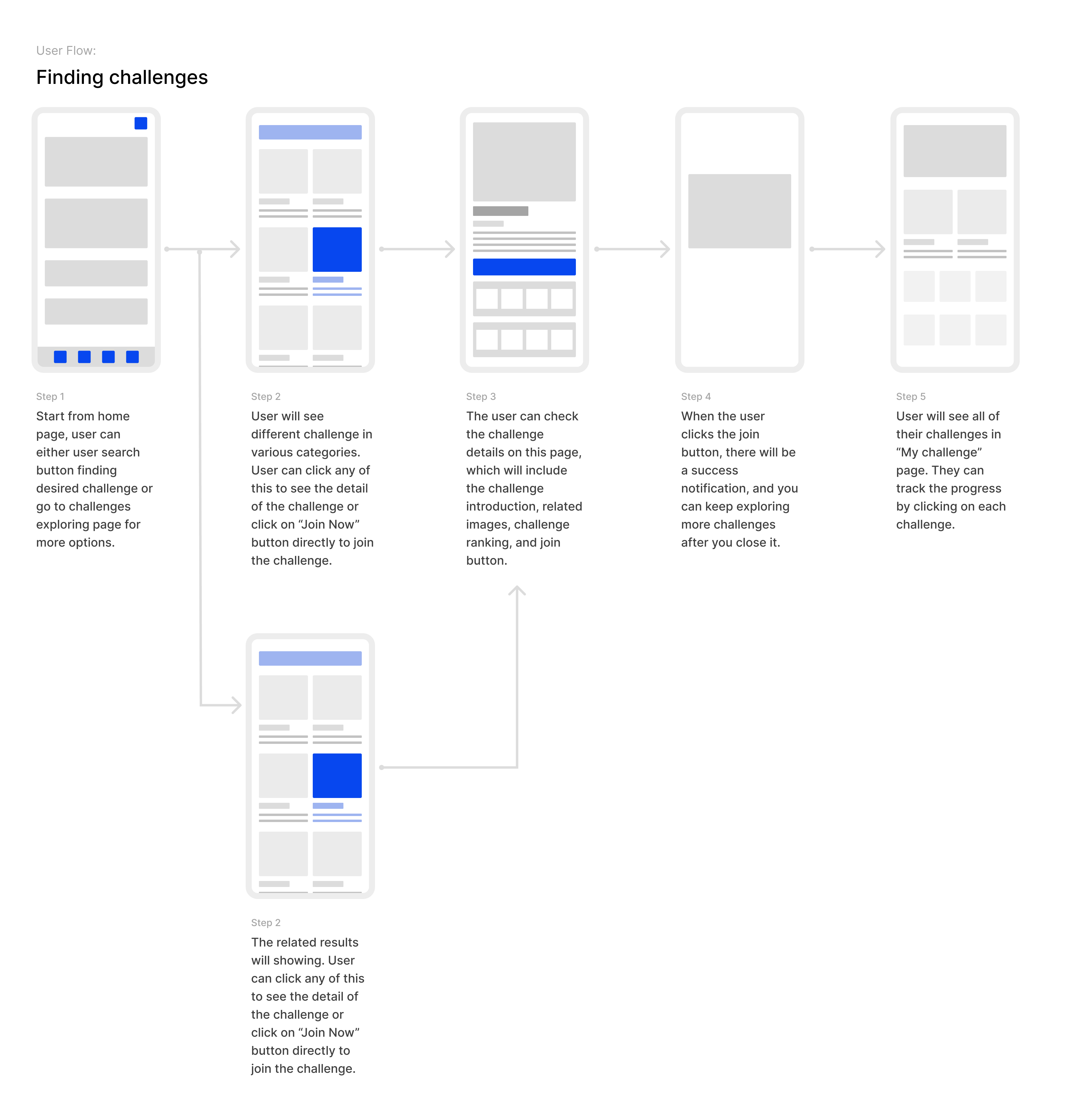
Before joining, someone needs duration, difficulty, requirements, rules, format, and reward. After joining, the same challenge becomes an active commitment: current progress, next action, daily task, ranking, reward milestone, and support should lead.
I designed separate Challenge Detail and Joined Challenge Detail states. Supporting challenge information remains available after joining, but no longer leads the hierarchy.
Low-fidelity Home, Profile, Challenge Detail, and Joined Challenge Detail screens established content priority before visual styling.
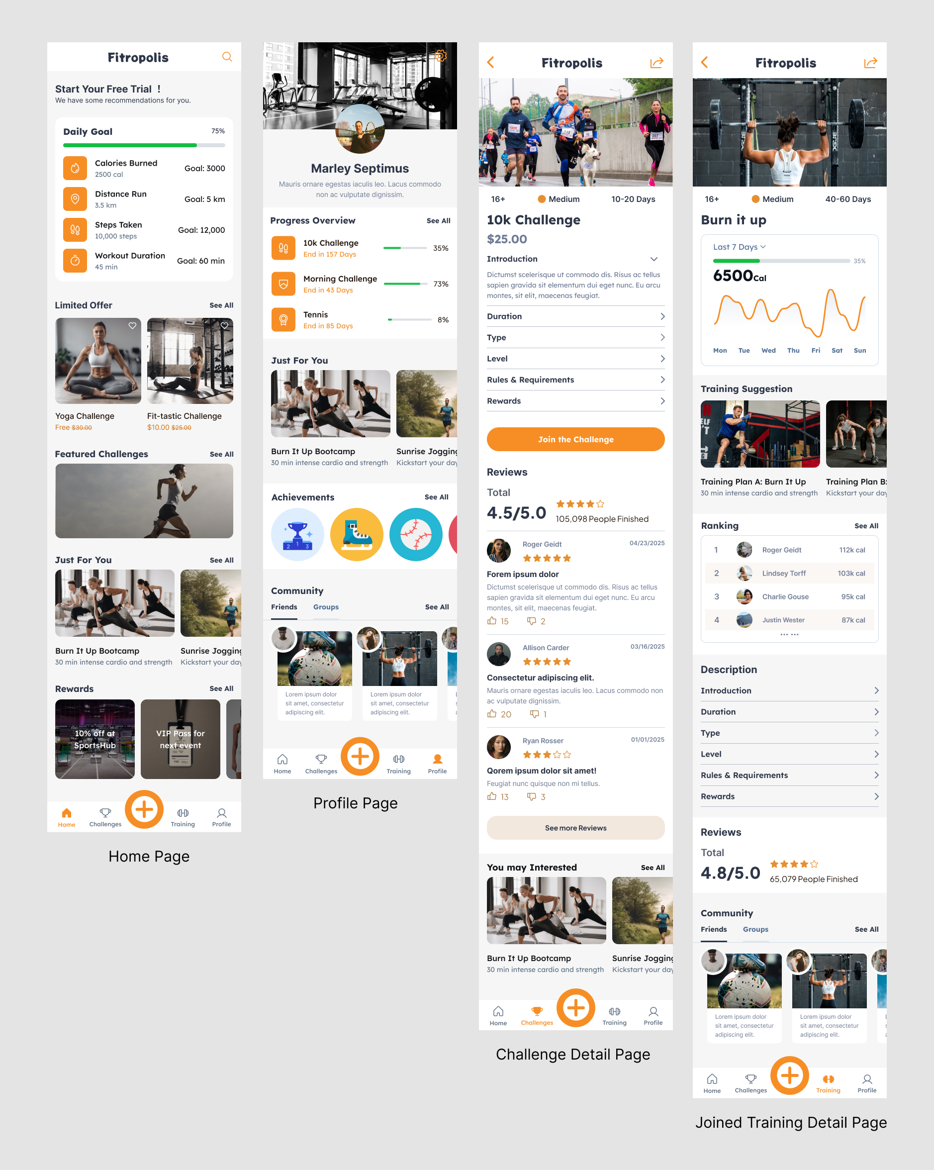
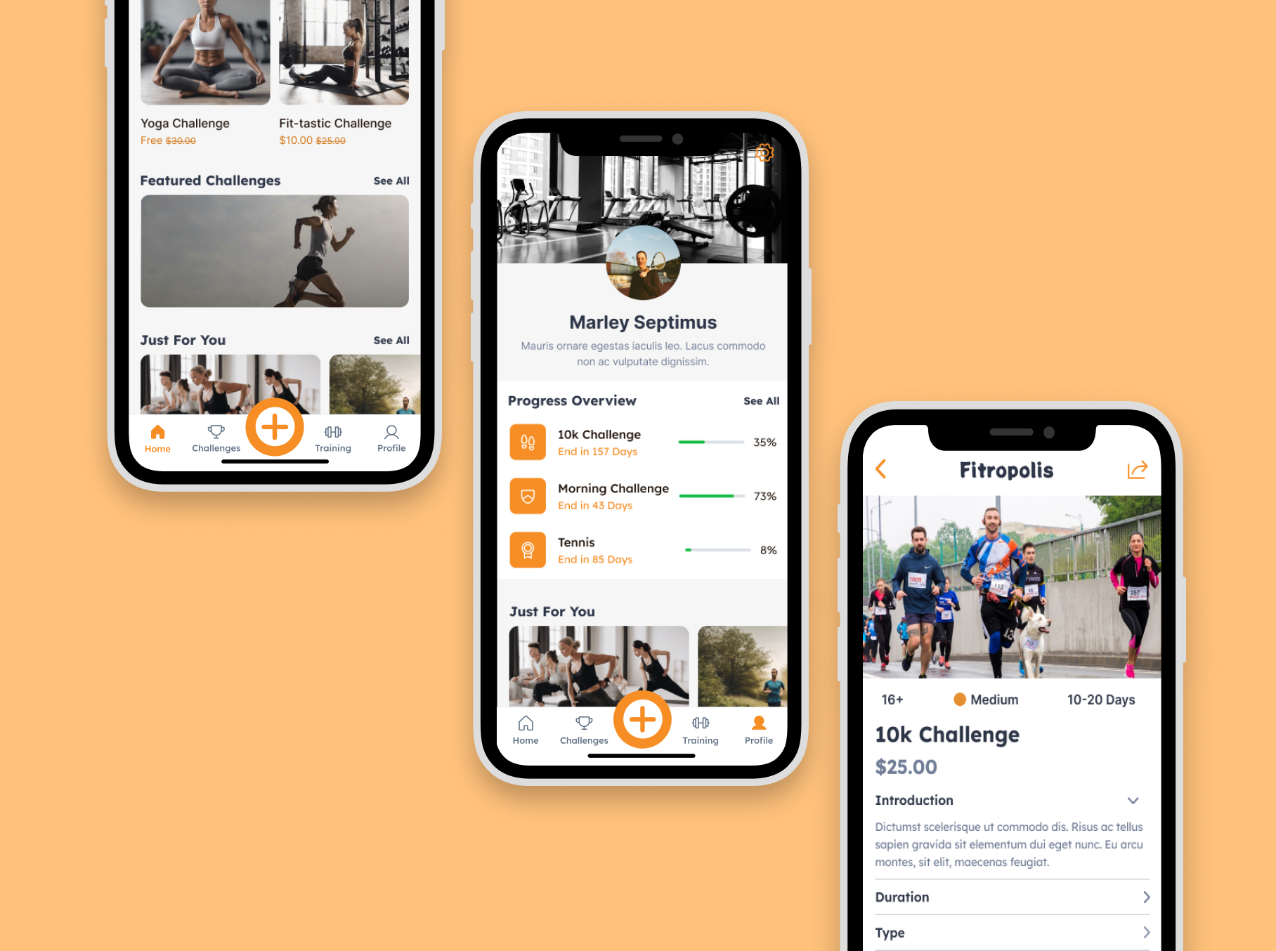
The high-fidelity system preserves shared components while changing hierarchy after someone joins.
Leaderboards can create accountability, but research indicated that competition alone could discourage beginners. I designed multiple progress signals: personal completion, individual and team formats, ranking for people motivated by comparison, rewards and milestones, and community entry points for support.
The active state prioritizes personal progress and the next action before broader rankings. Competition is one motivator, not the definition of success.
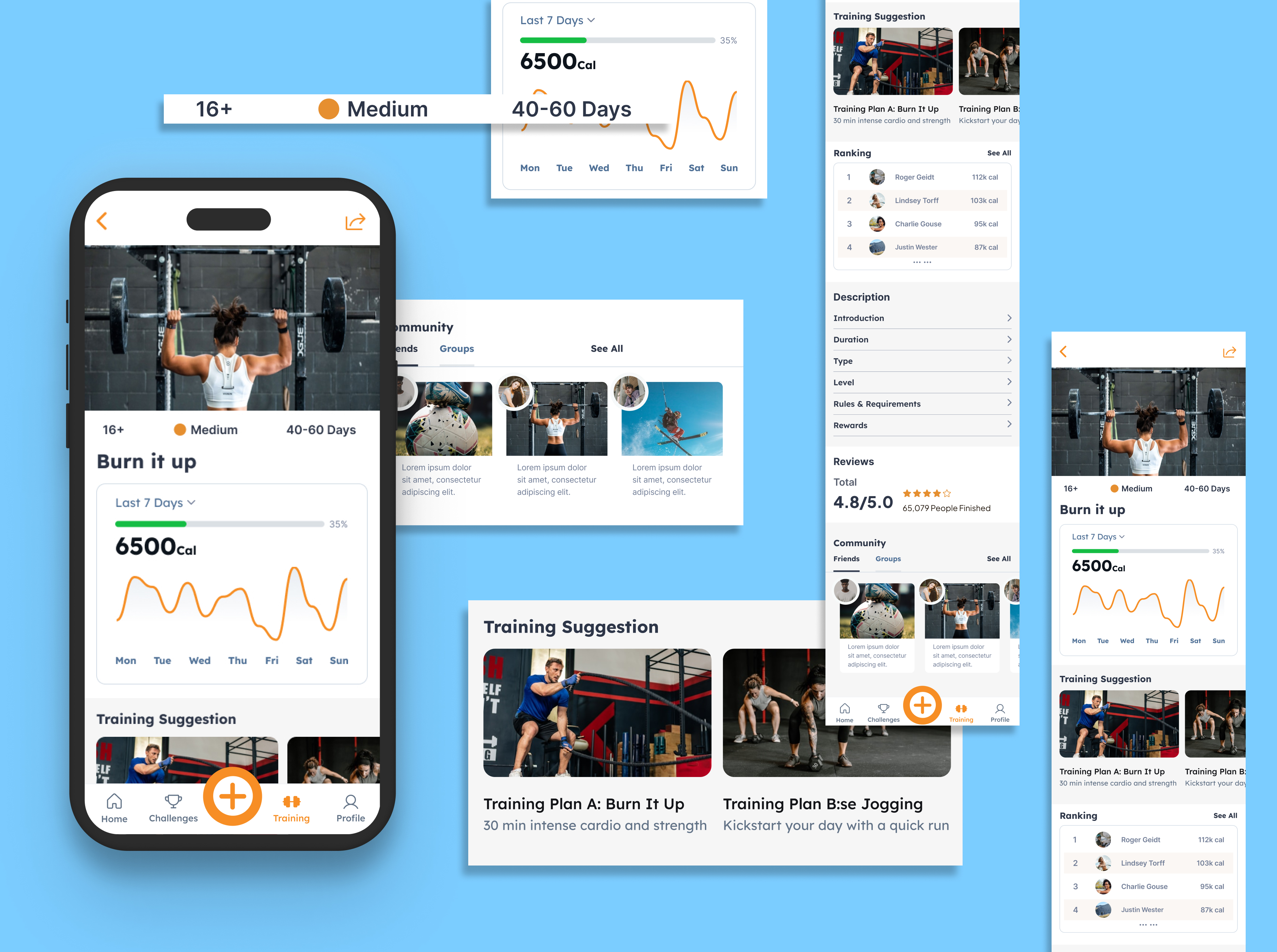
I built the mobile system in Figma with warm orange accents for action, progress, and reward; rounded cards for challenge modules; consistent bottom navigation; clear metric hierarchy; repeated challenge-state components; progress bars and charts; and compact ranking and reward patterns.
Home supports daily progress and discovery. Profile records current challenges and achievements. Challenge Detail supports evaluation, while Joined Challenge Detail prioritizes active progress. The system keeps those screens related without giving every state the same hierarchy.
I own research synthesis, product scope, UX architecture, user flows, wireframes, the Figma prototype, high-fidelity UI, the design system, developer handoff, and design QA. My engineering partner owns implementation and contributes technical-feasibility feedback.
The Fitropolis MVP is in active development and not yet launched. Future concepts such as AI coaching and advanced personalization remain outside the MVP until the core join-and-track lifecycle is validated.
The strongest product decision was reducing scope. A broad fitness platform could contain many attractive features, but it would not reveal whether the challenge lifecycle was understandable or motivating.
Separating evaluation from active tracking created a clearer product structure, a more focused MVP, and a testable pre-launch hypothesis. The UI system supports that decision by making current state, progress, and next action visible.